Ontario Science Centre
–Corporate Brand Identity–
Length: 1 Semester
Role: Brand designer, strategist
Team: Solo
Tools: Adobe Indesign, Illustrator, Photoshop
How might we update a standard looking brand to be more dynamic and attractive to the existing and new customer bases?
The Process:
1. Research the existing brand
2. Strategize and plan the new brand
3. Create brand identity guidelines
While OSC has an acceptable brand identity, it can be improved in numerous ways.
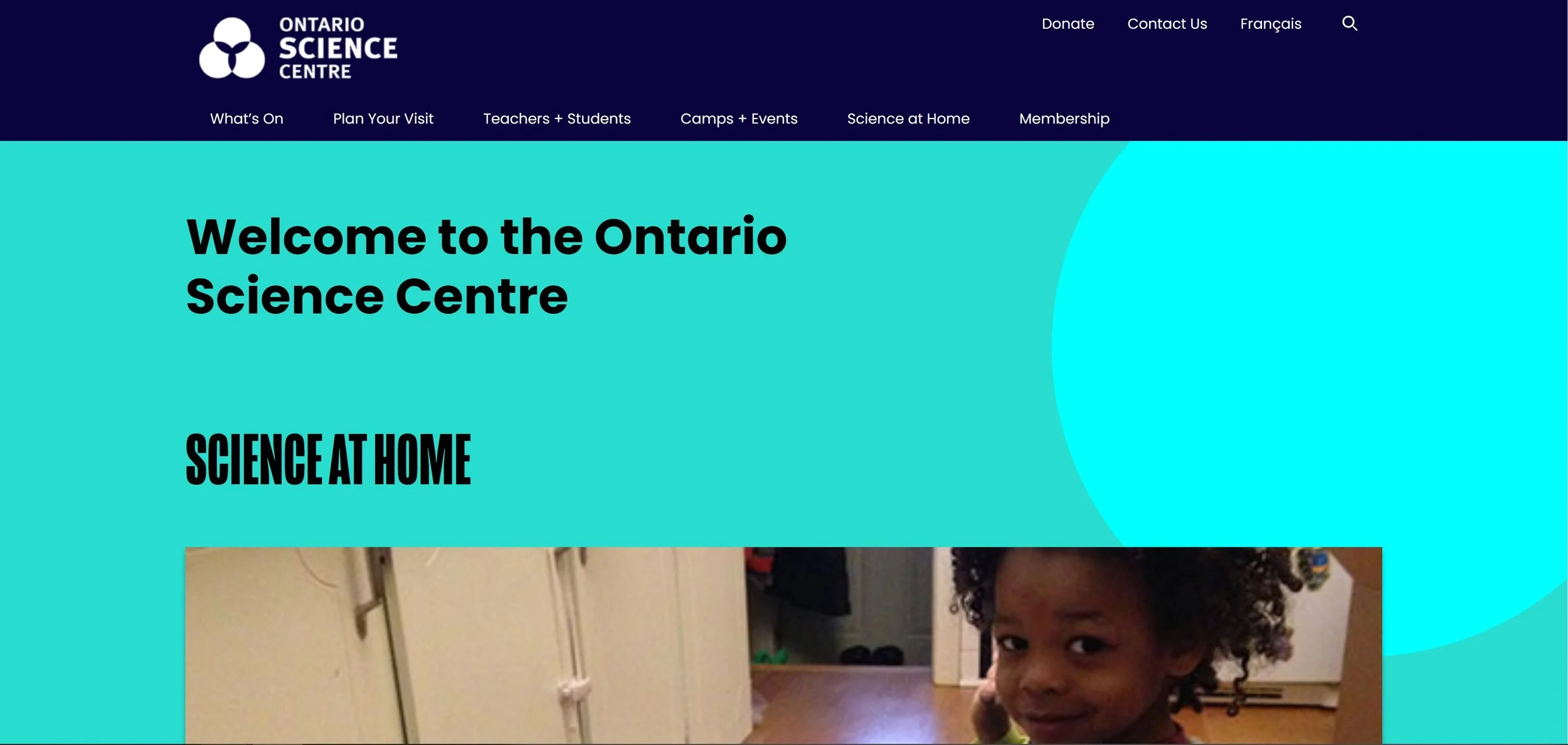
The Ontario Science Centre brand and website is currently using a very standard looking colour palette/font choice. Their logo represents the three domes that make up the Science Centre, and use the white trillium to symbolize its a government of Ontario institution. Overall it makes sense, but to me the brand doesn’t represent the excitement that I got from going to the Science Centre as a kid.
TL;DR: OSC’s generic brand kills my excitement, time to make it better!
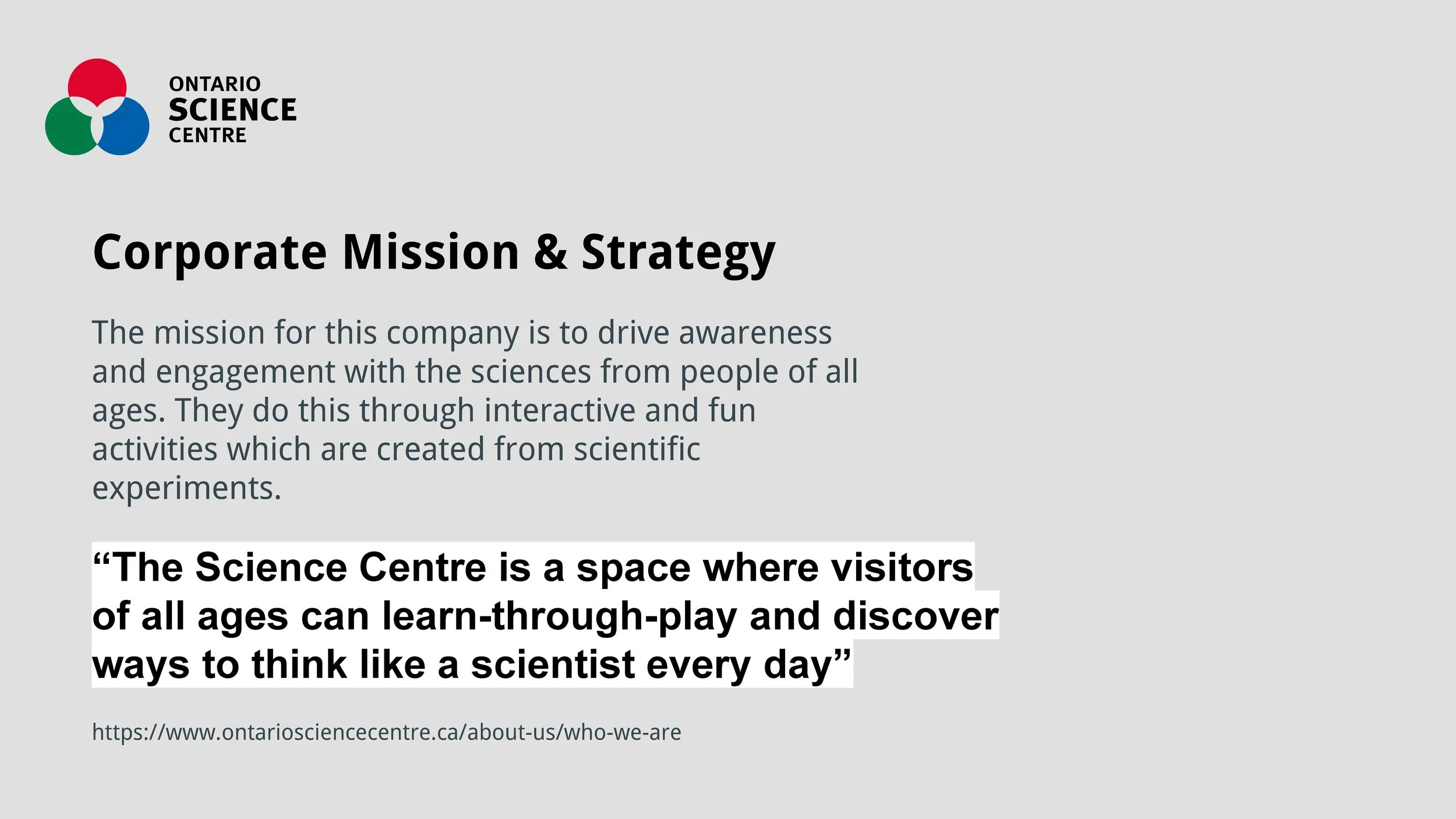
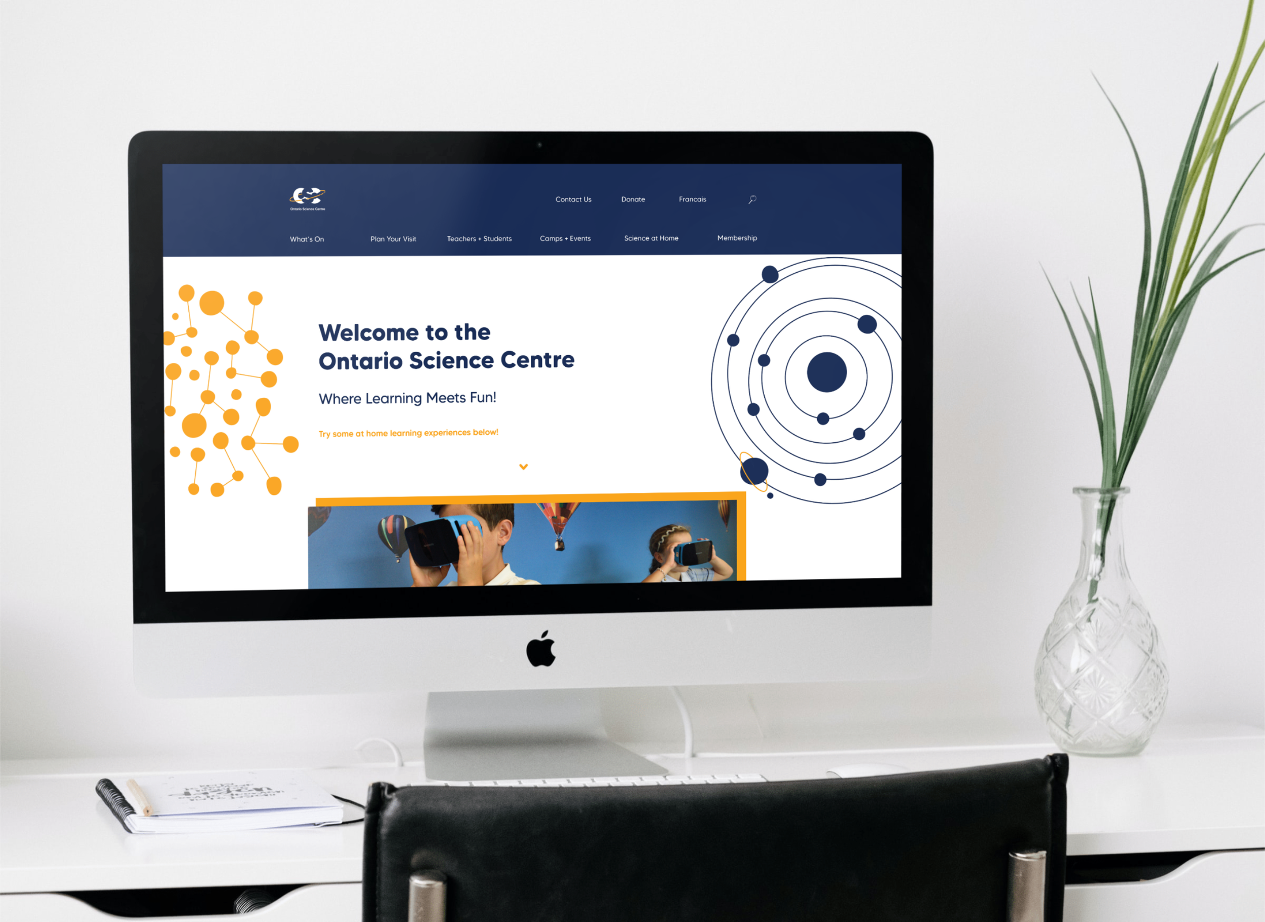
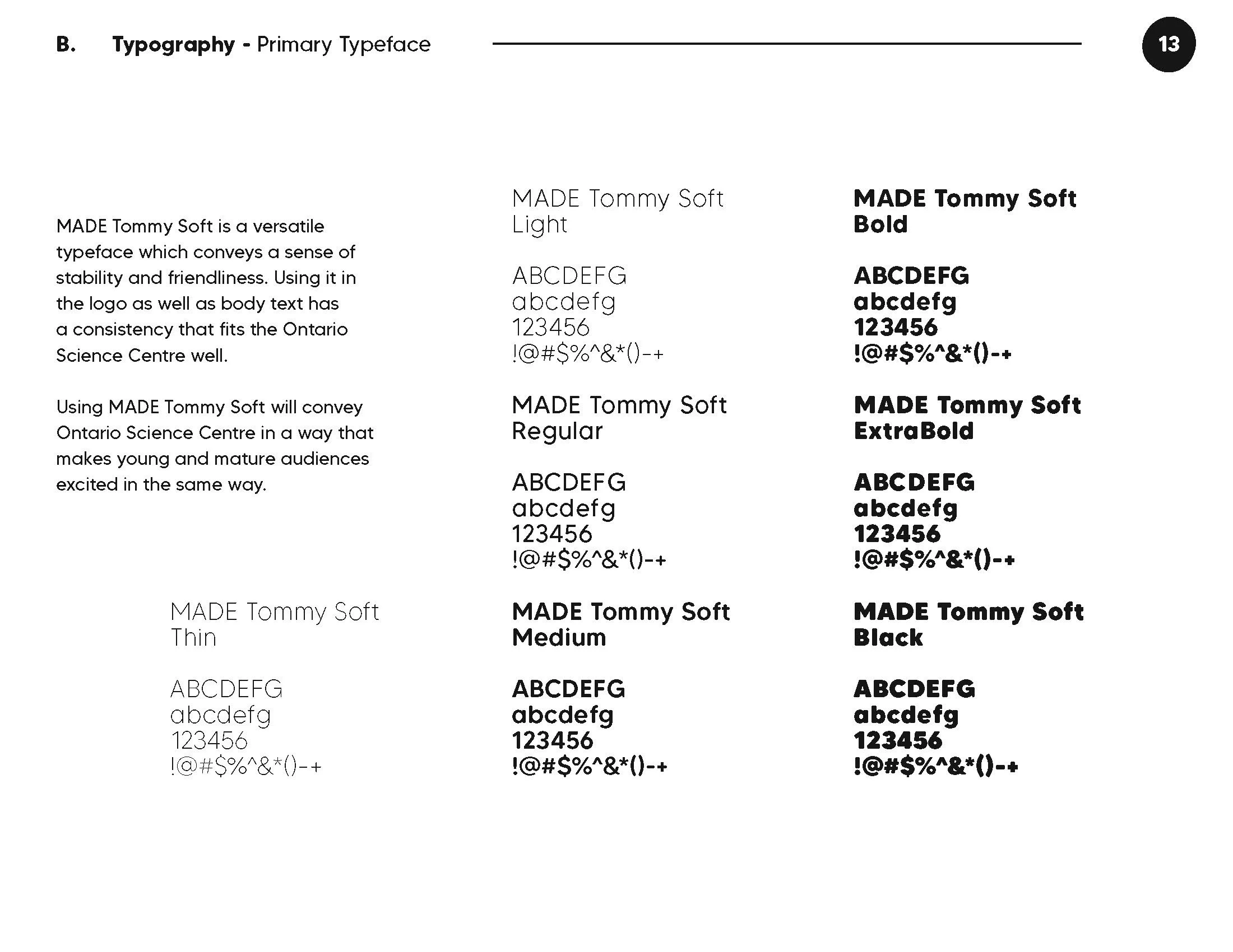
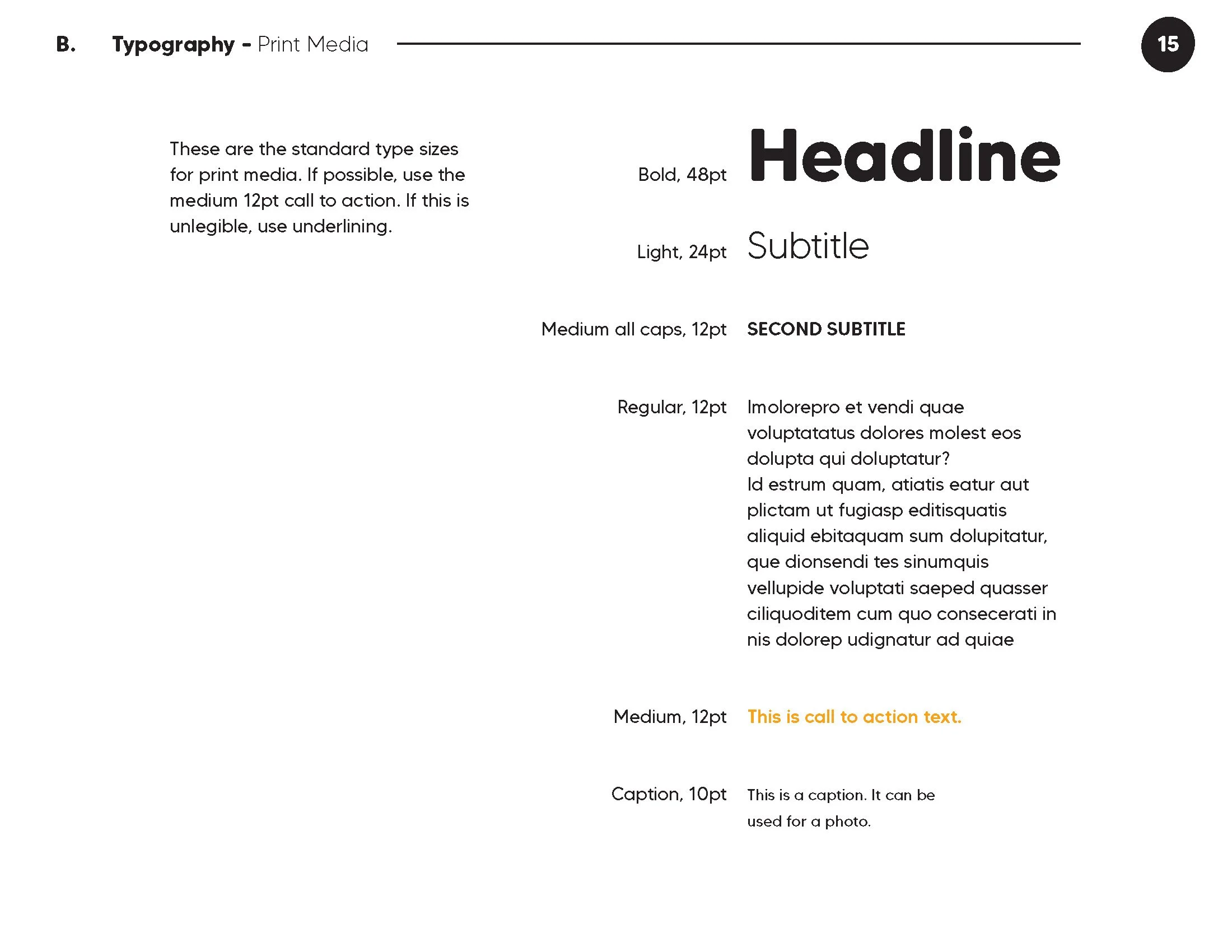
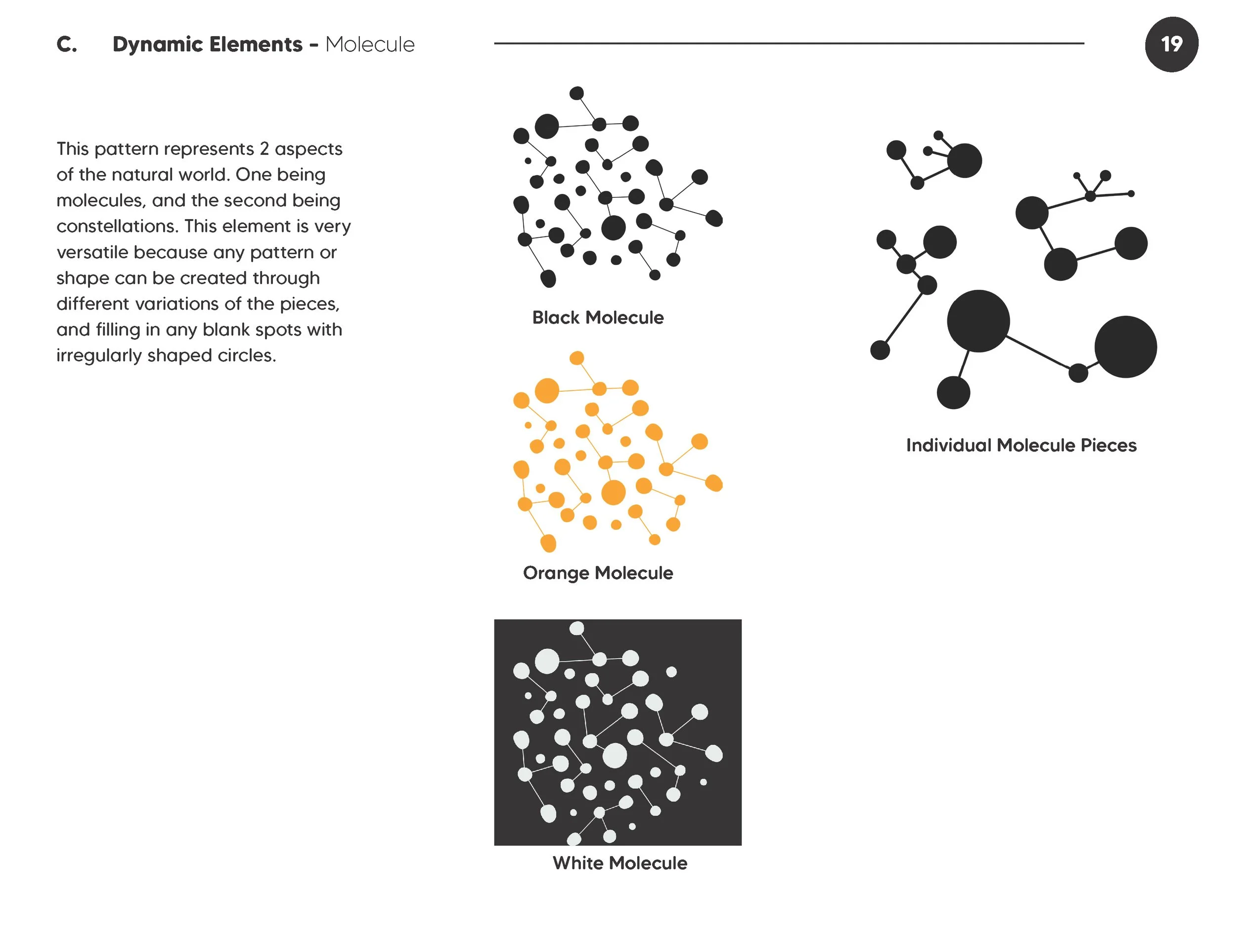
Creating dynamic elements and using a more appropriate font will make a huge difference in the feeling of the brand identity.
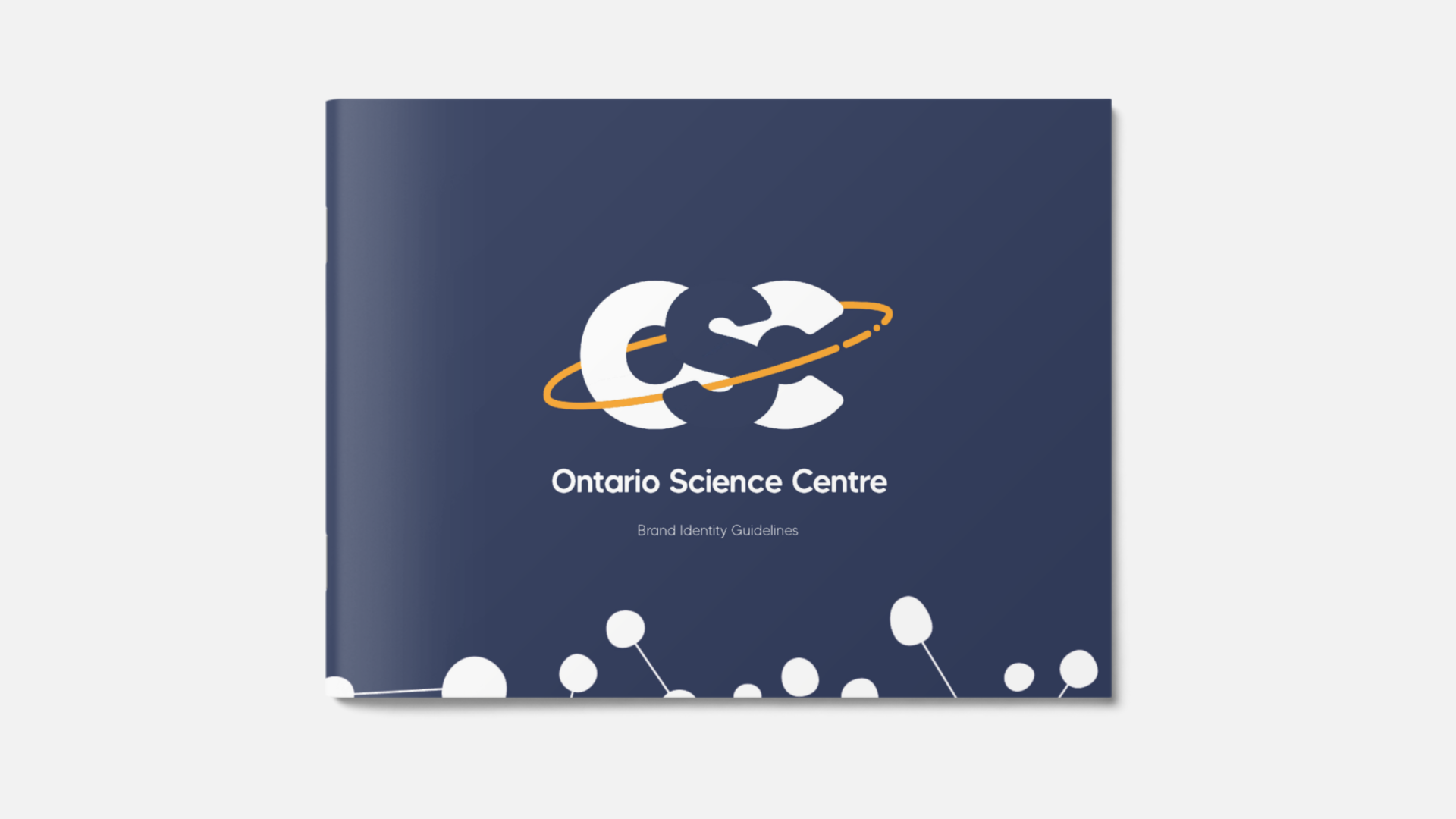
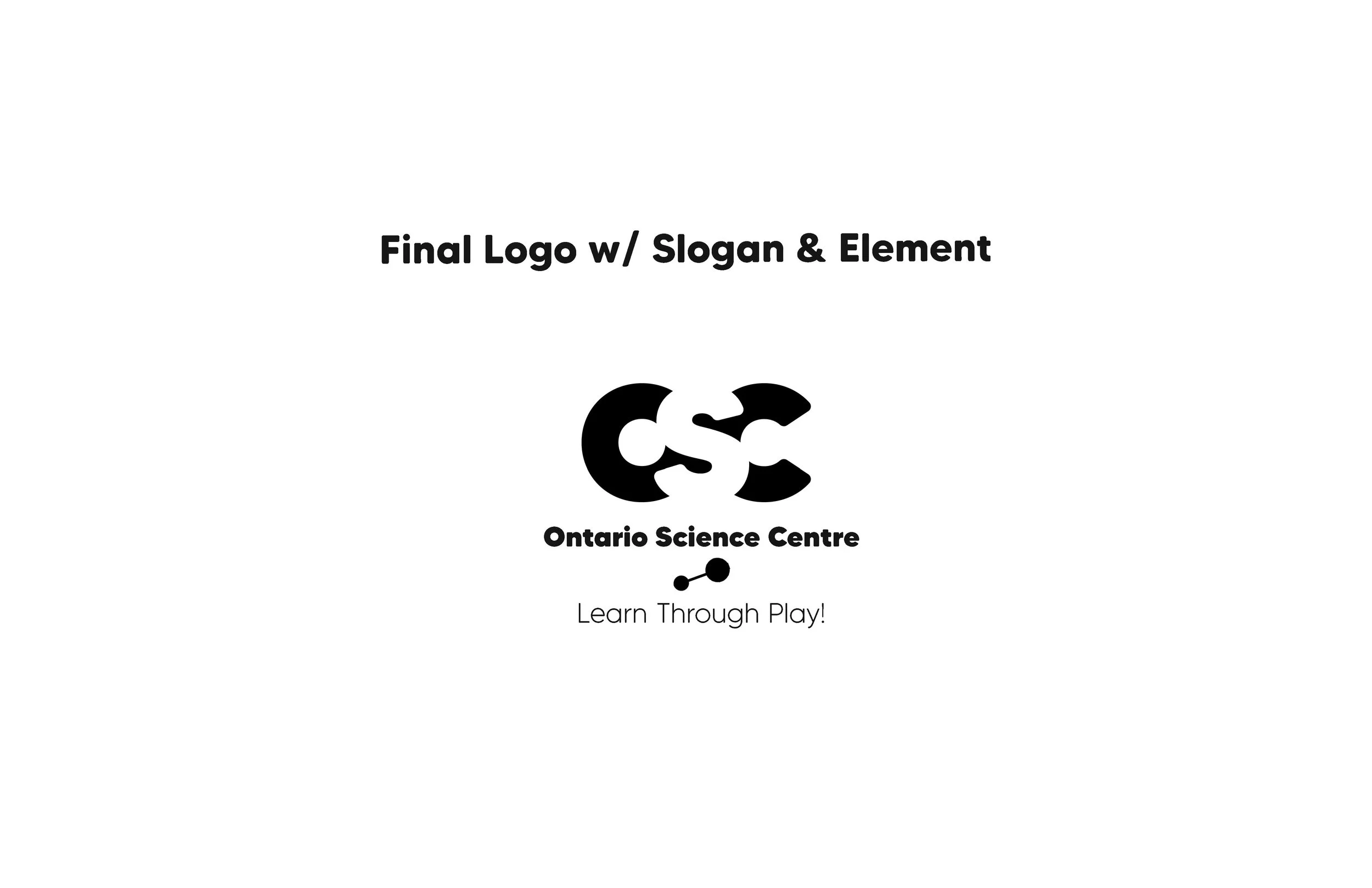
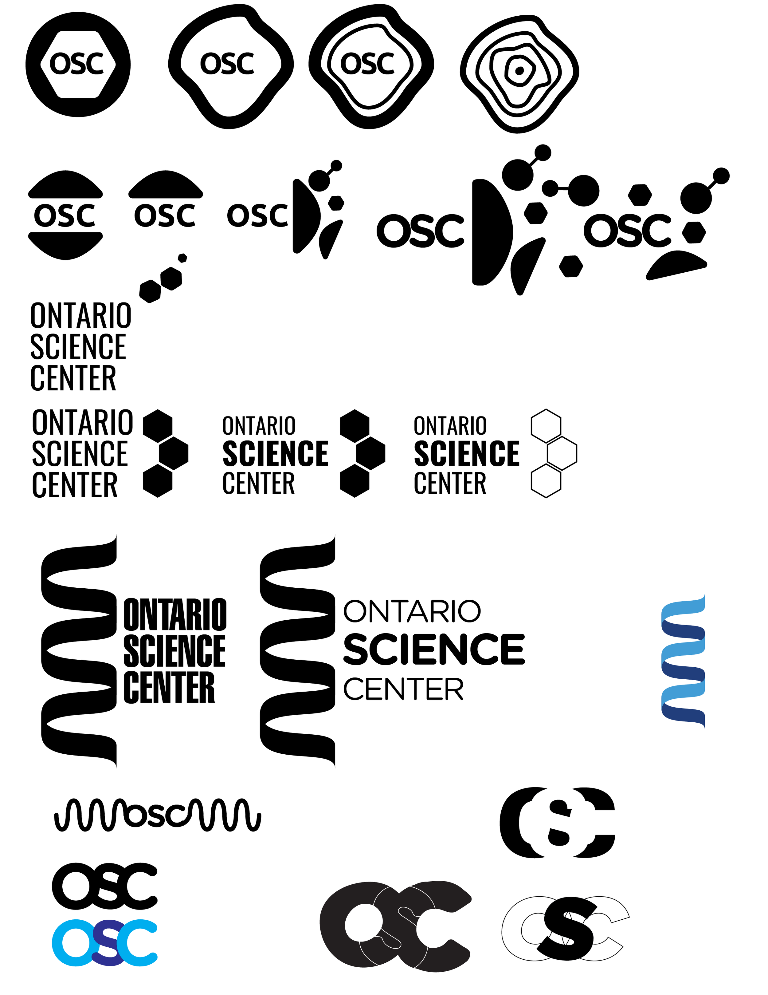
I made this presentation to show what the final logo was after many different sketches and iterations.
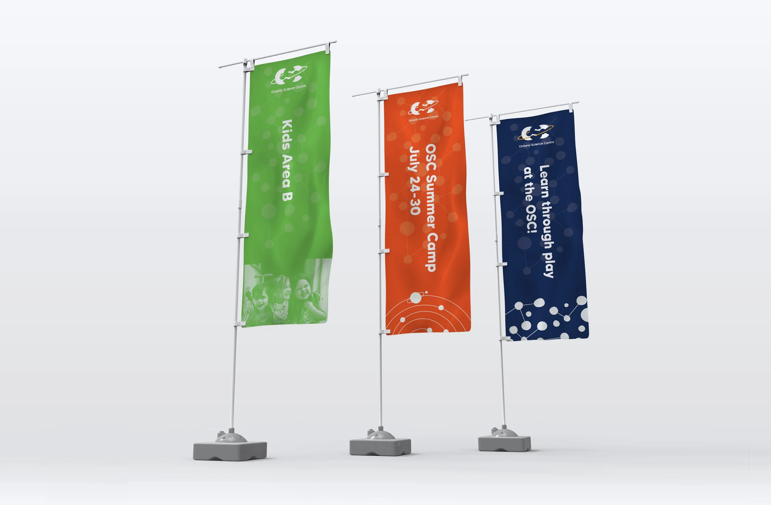
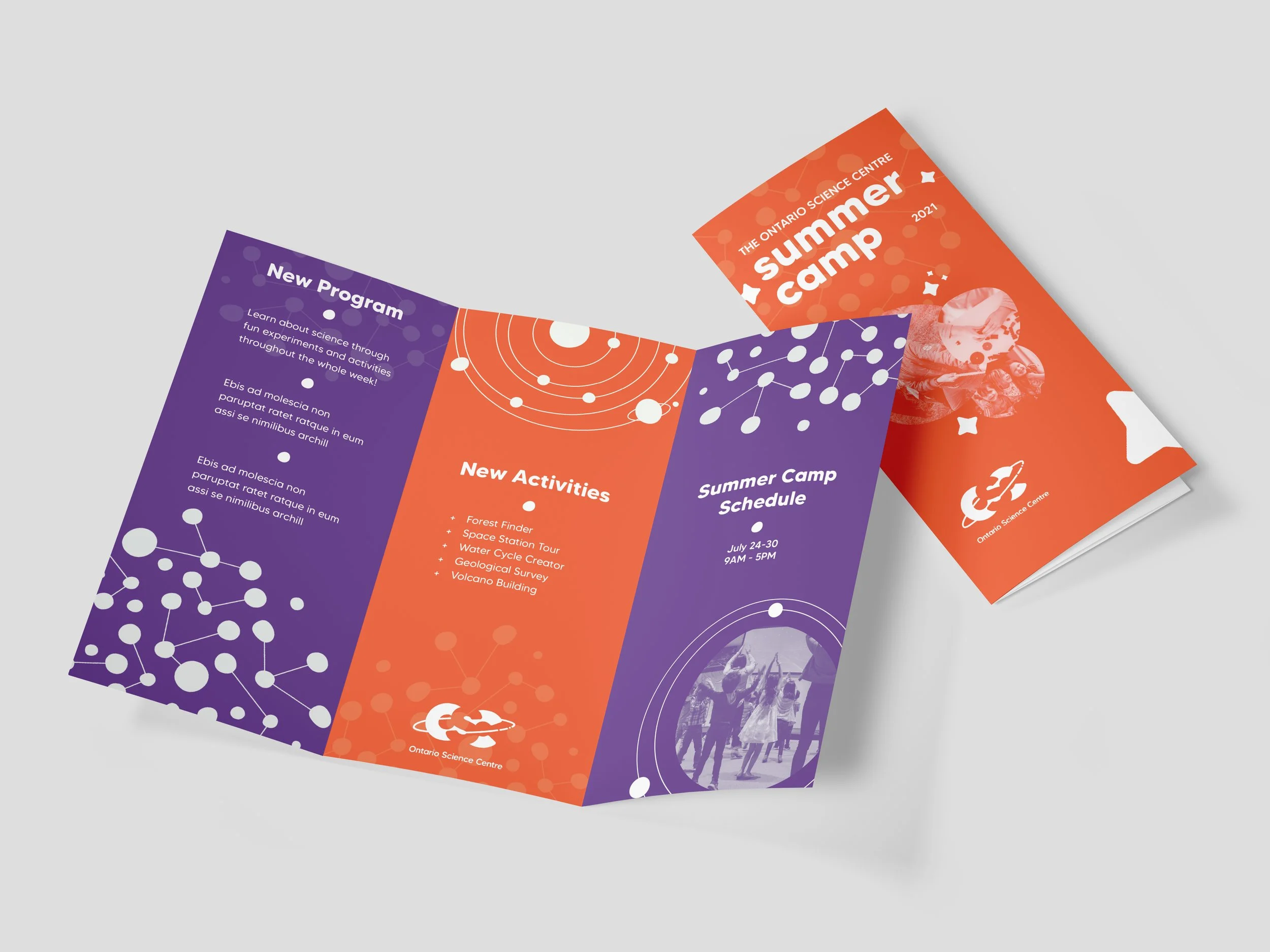
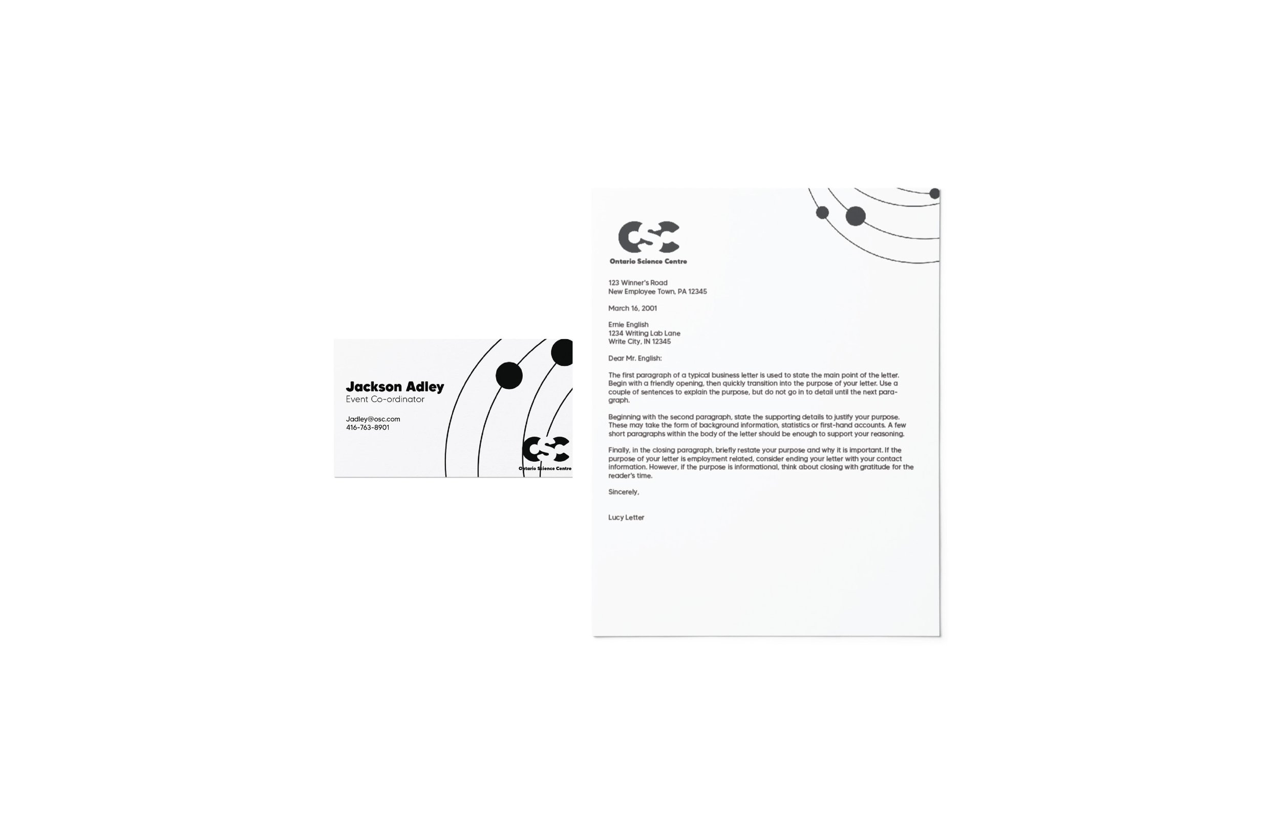
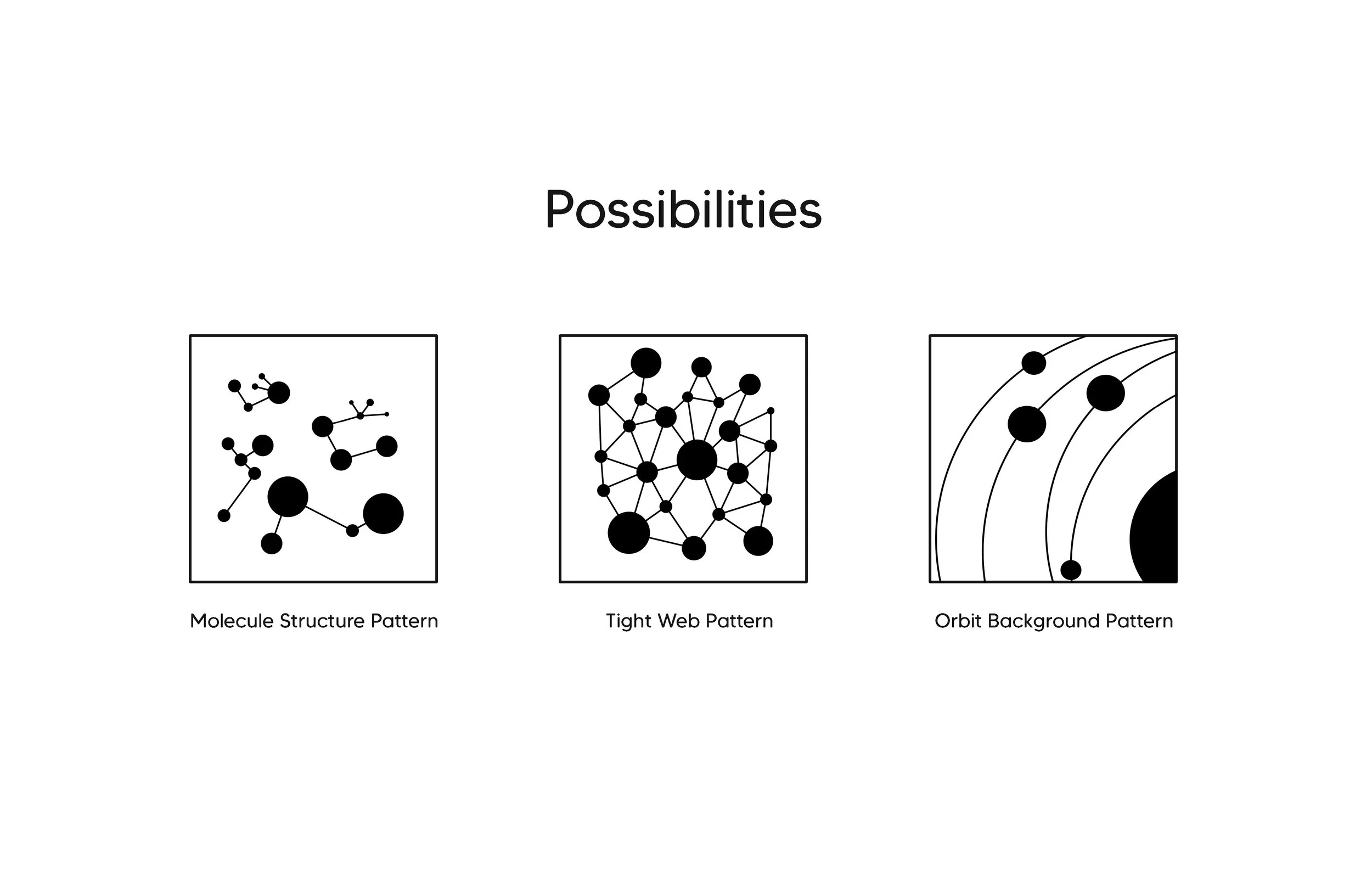
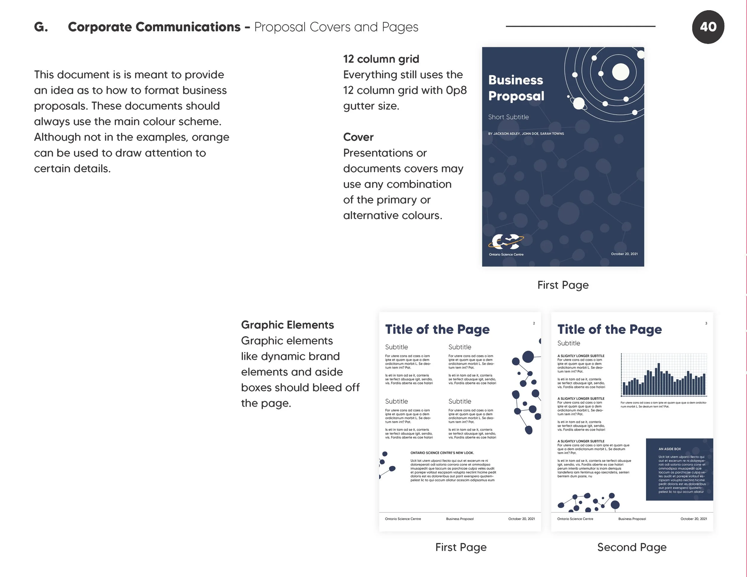
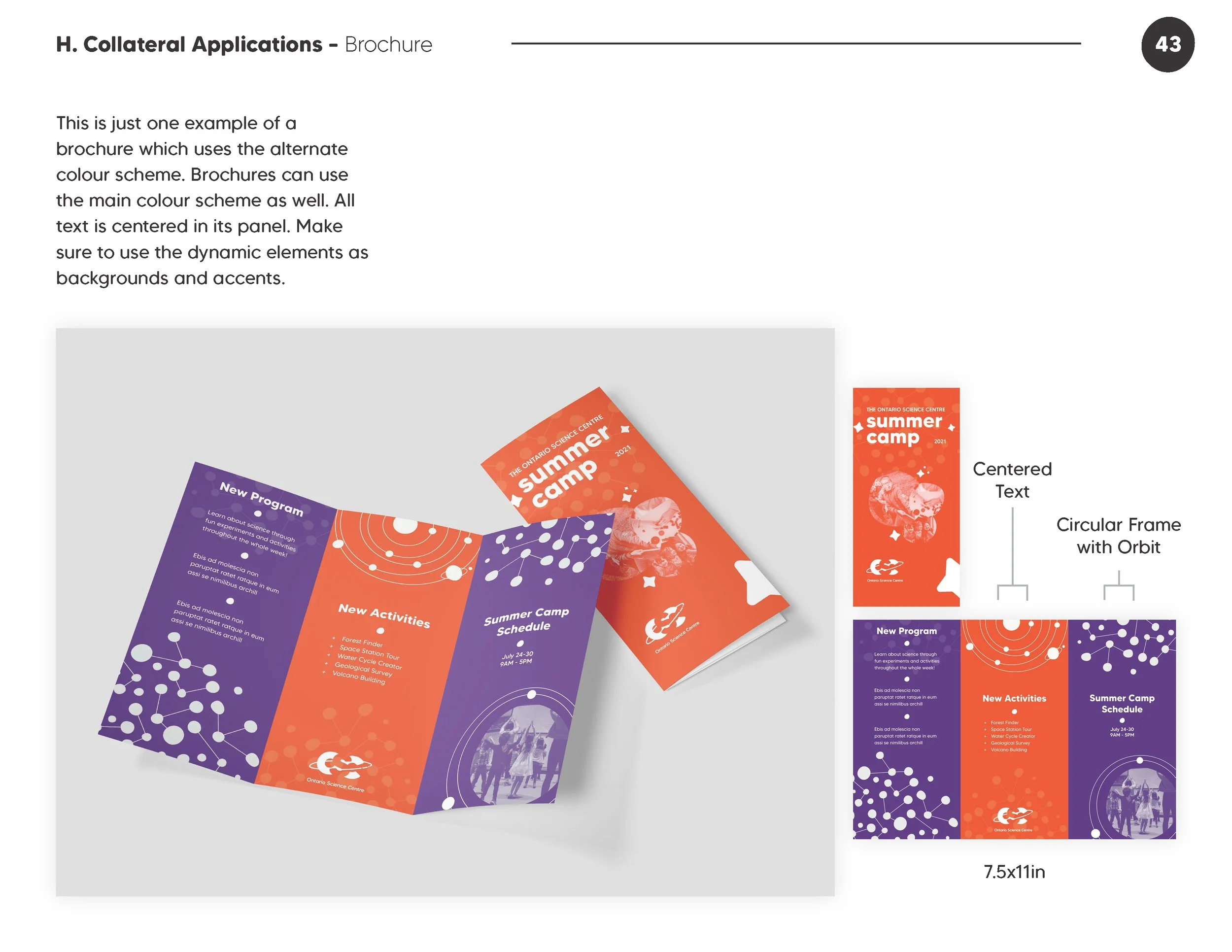
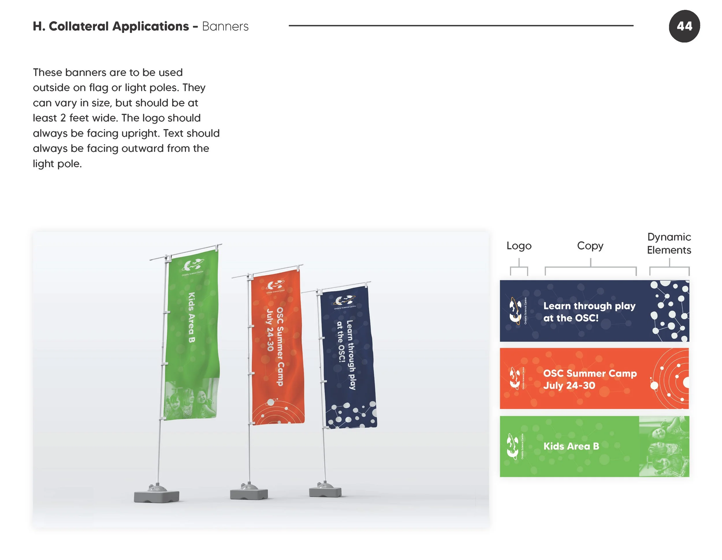
I also created dynamic elements that fit within the brand that can be used in everything from internal documents to marketing materials.
Creating the logo was an iterative process. It went through many revisions before I considered it finished.
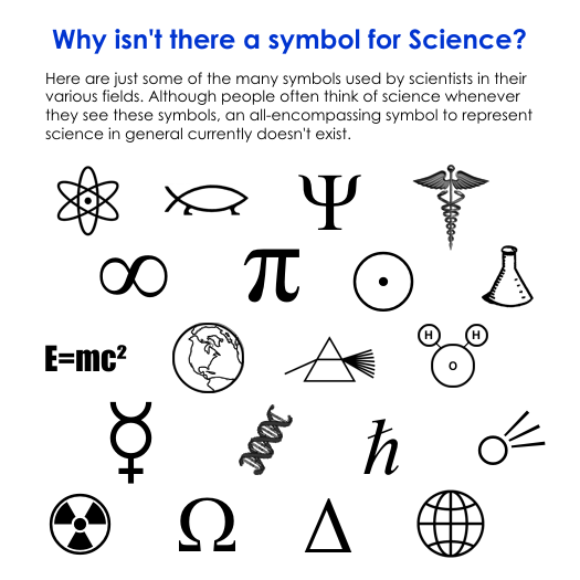
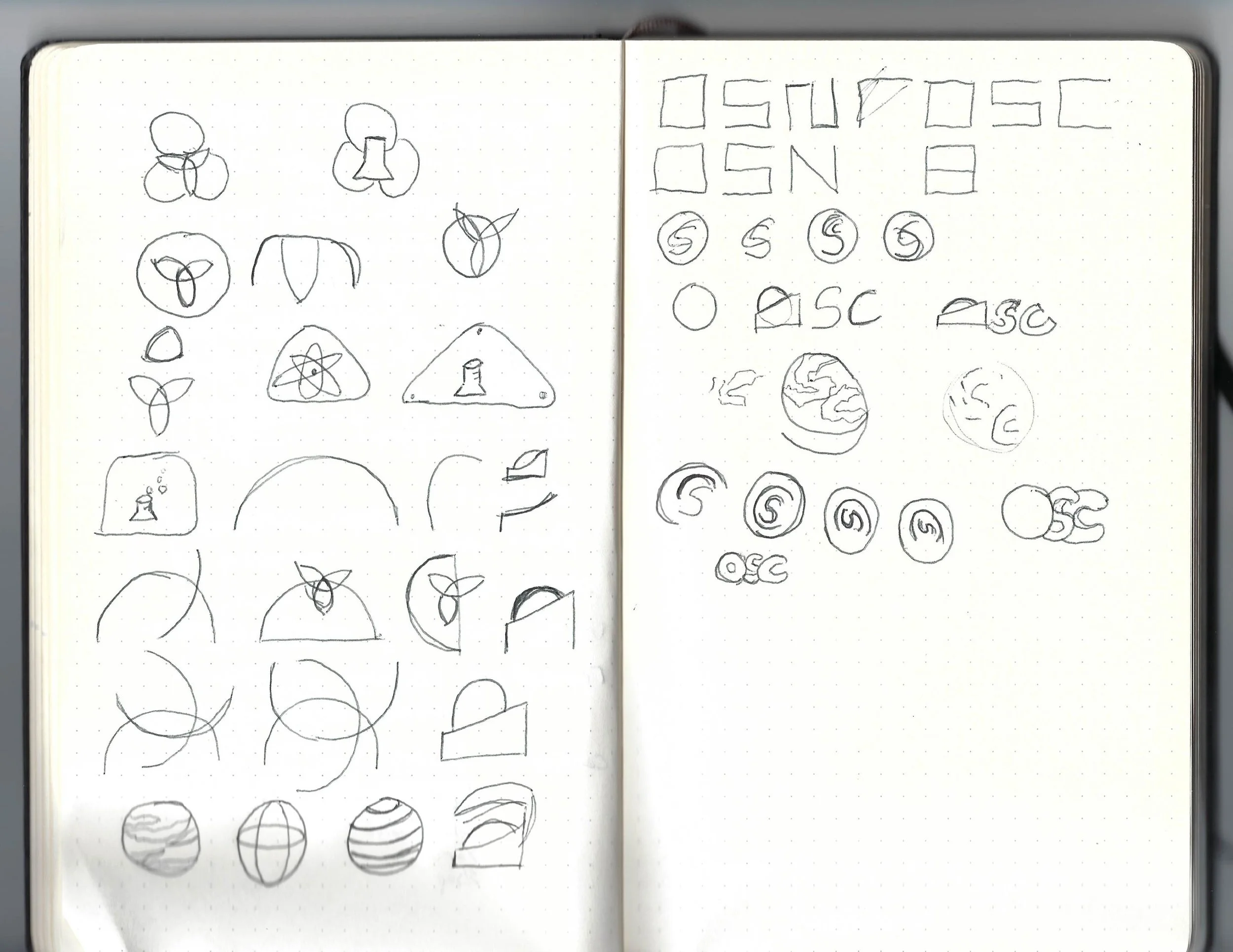

When creating the logo at first I tried to incorporate popular scientific symbols with the dome theme from the previous logo.
I had to scrap a lot of ideas because they just weren’t visually appealing or they seemed unoriginal or uninspired.
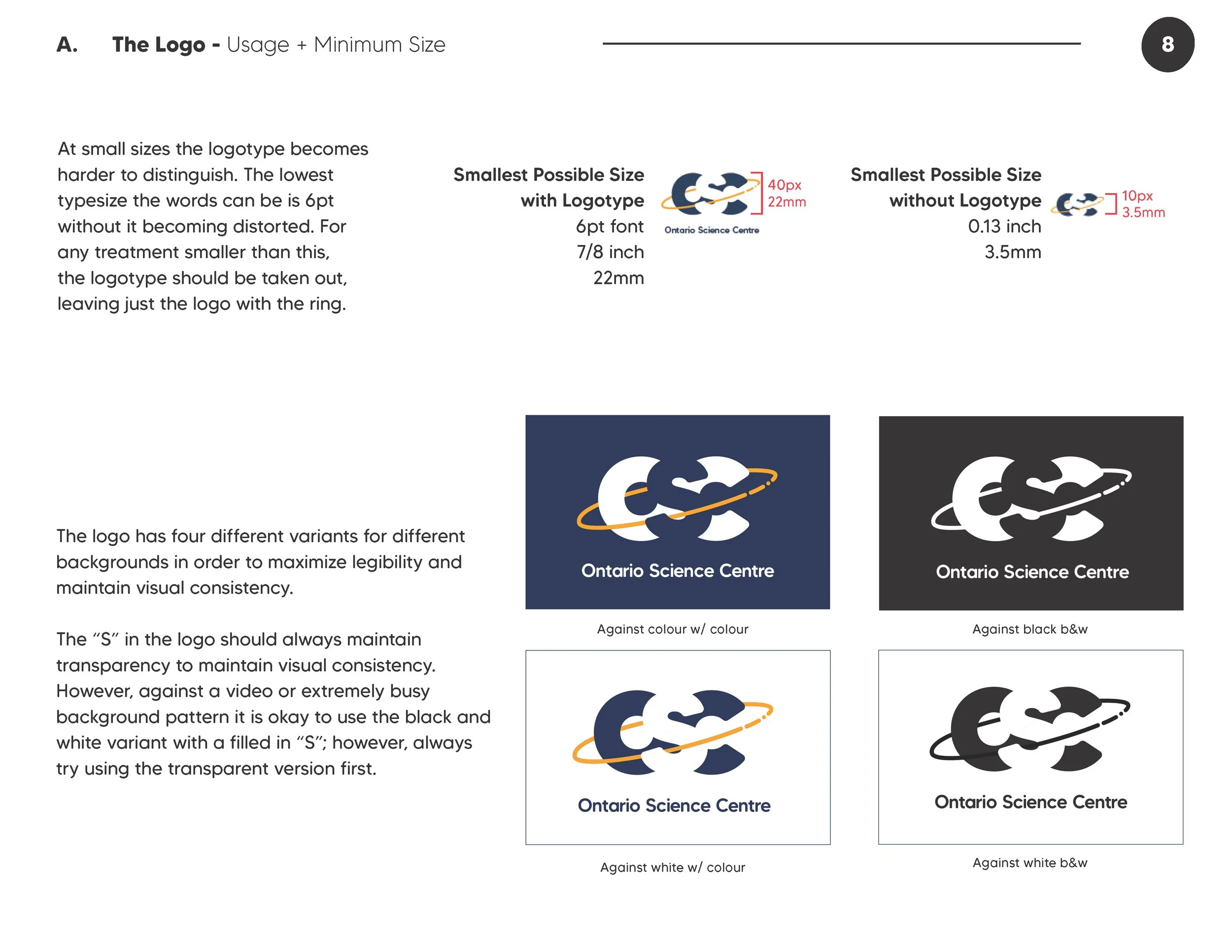
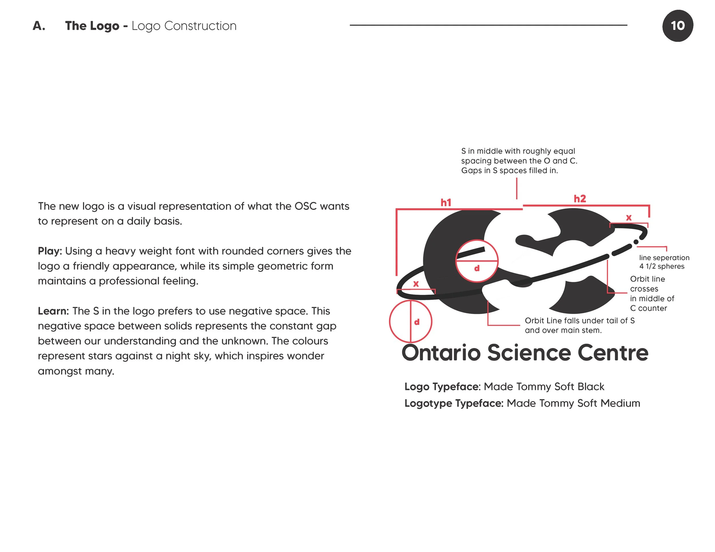
I settled on a design that still has some roundness of the domes, and has an orbiting line to create a science/space theme.
The negative space S represents the gap in our knowledge.
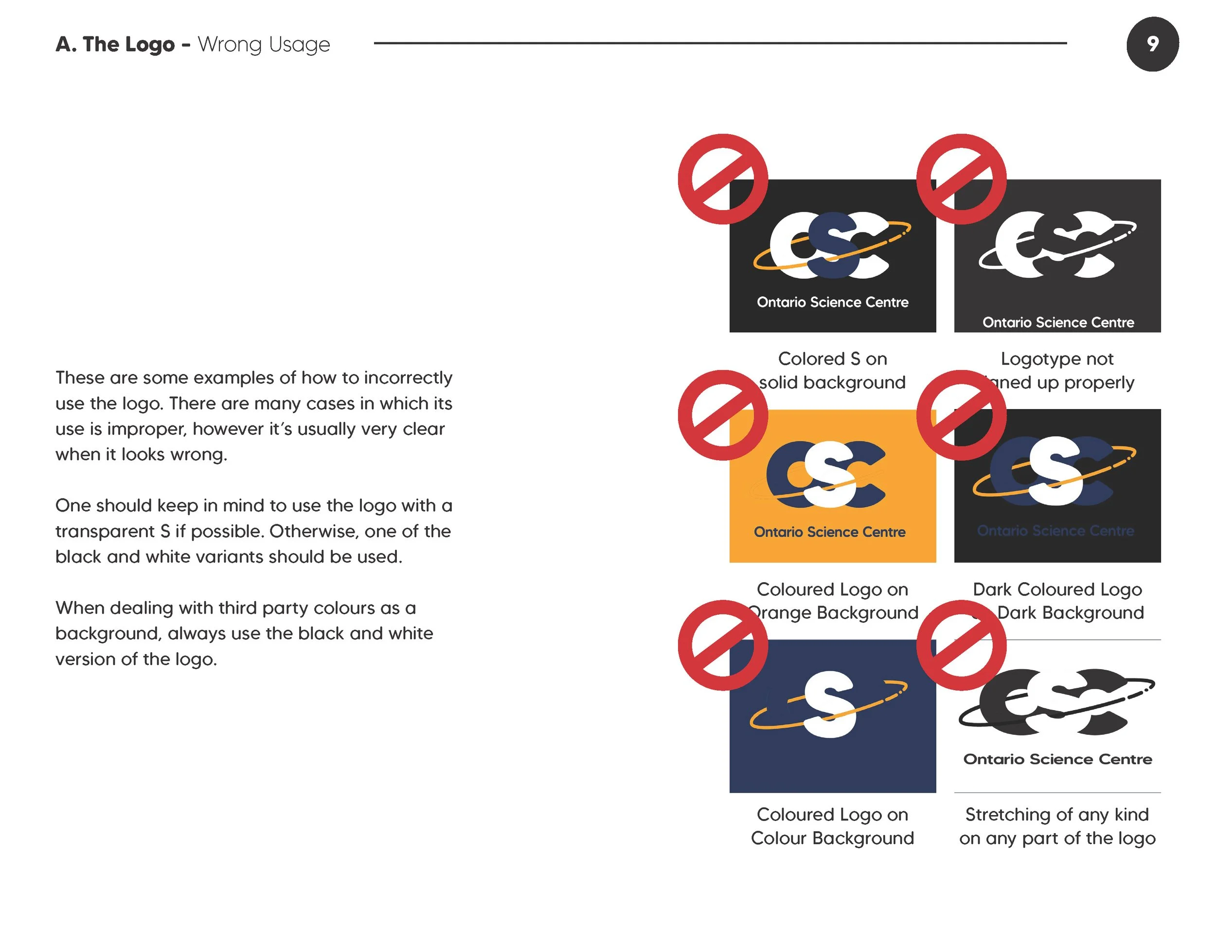
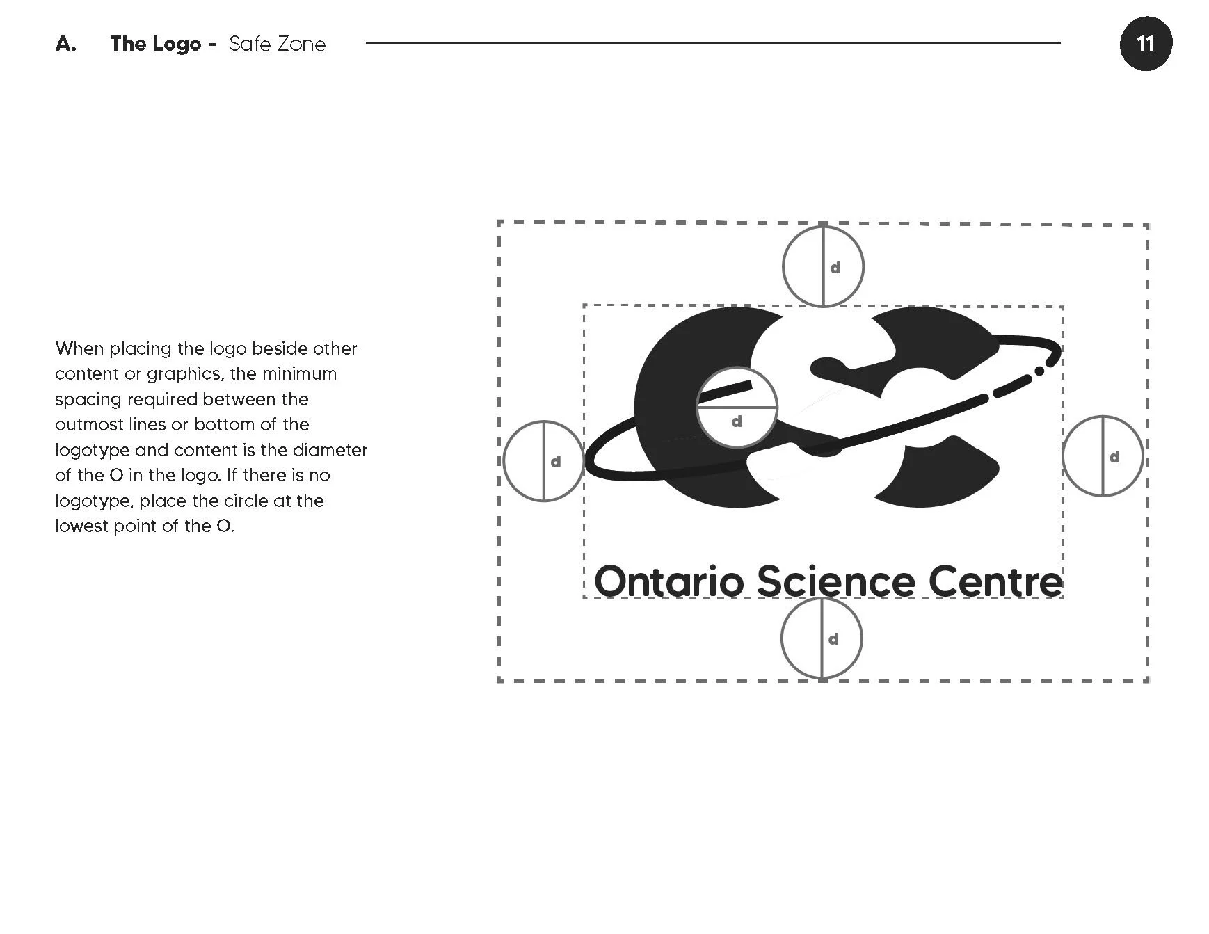
I made sure to create a logo that was legible at small sizes and on all types of backgrounds.
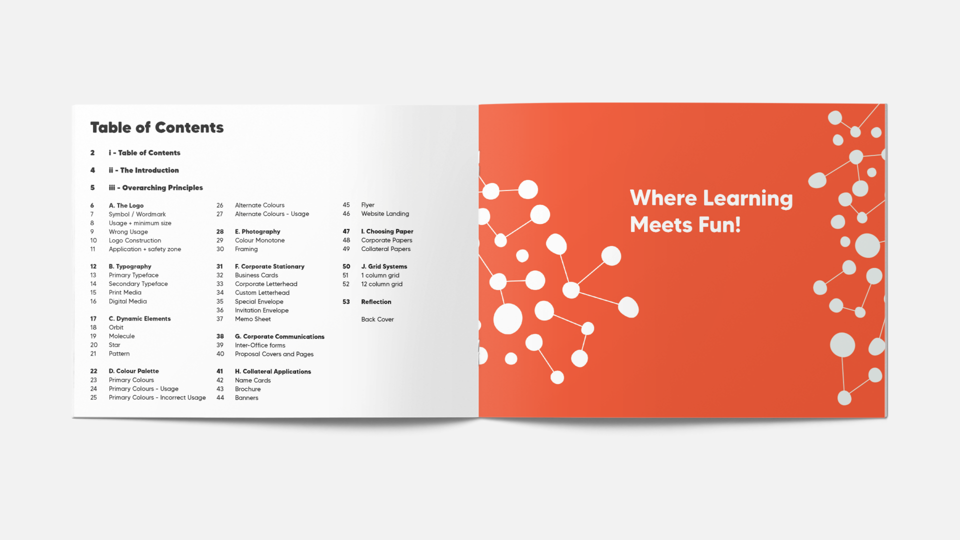
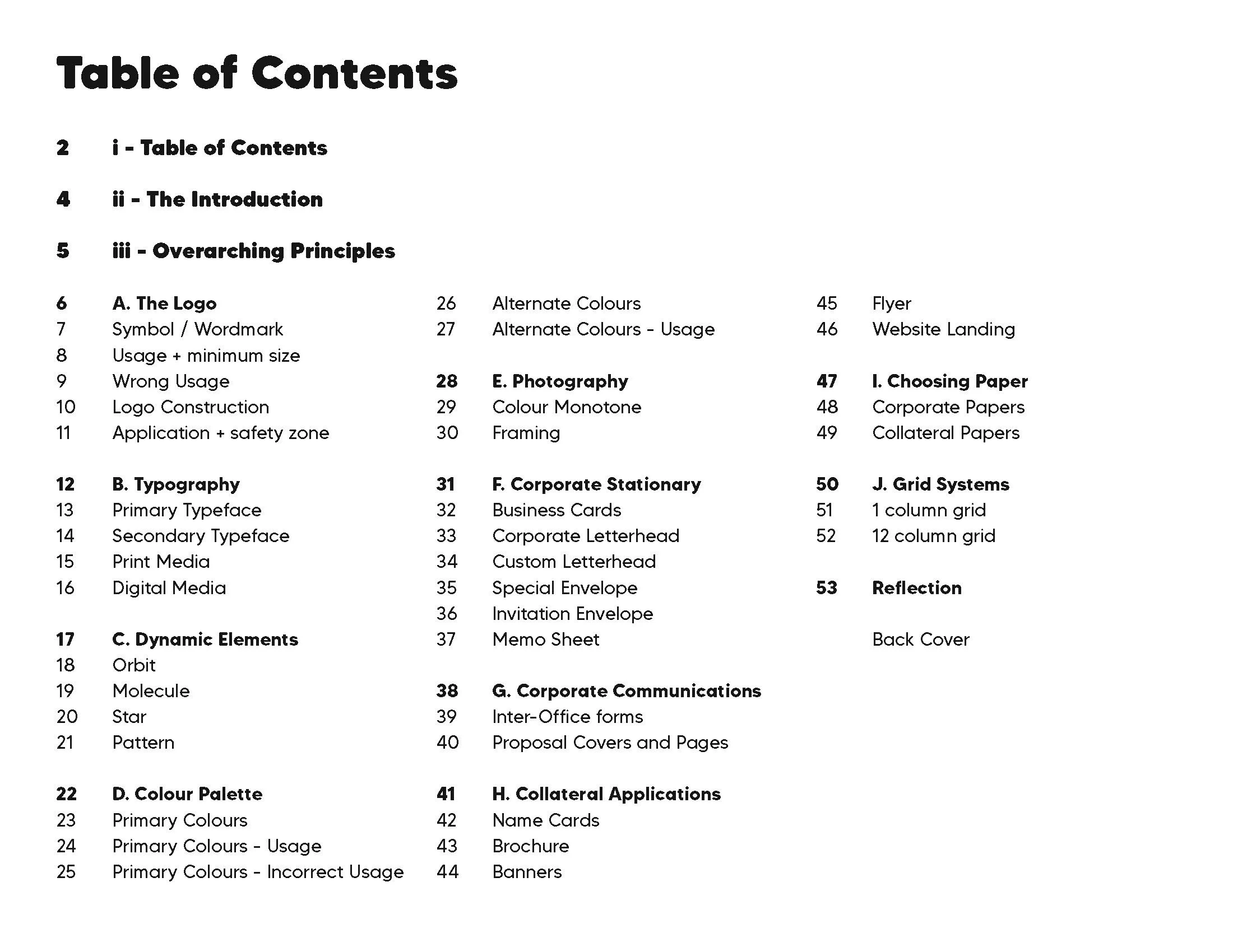
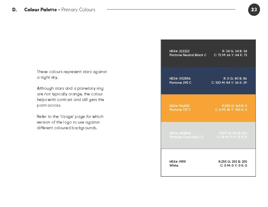
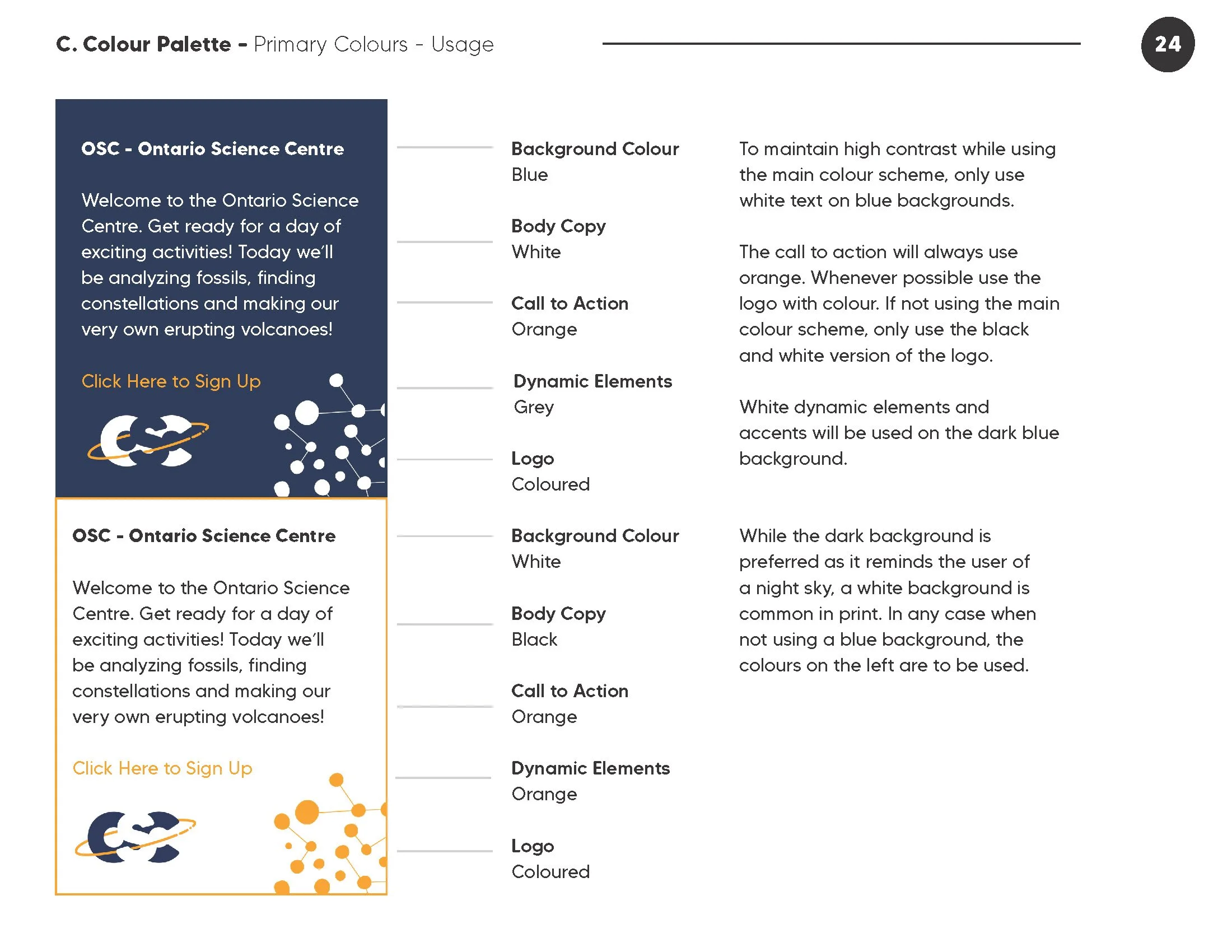
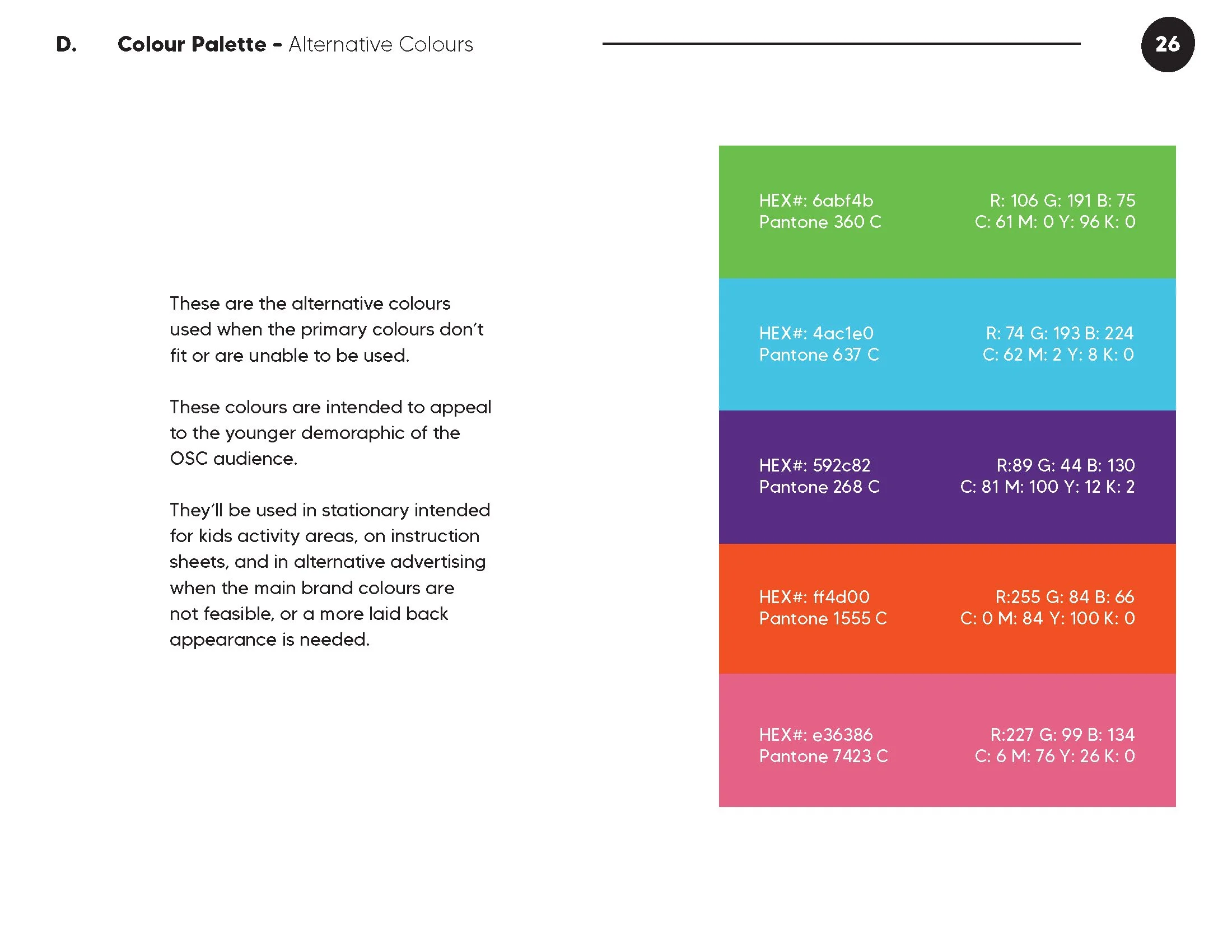
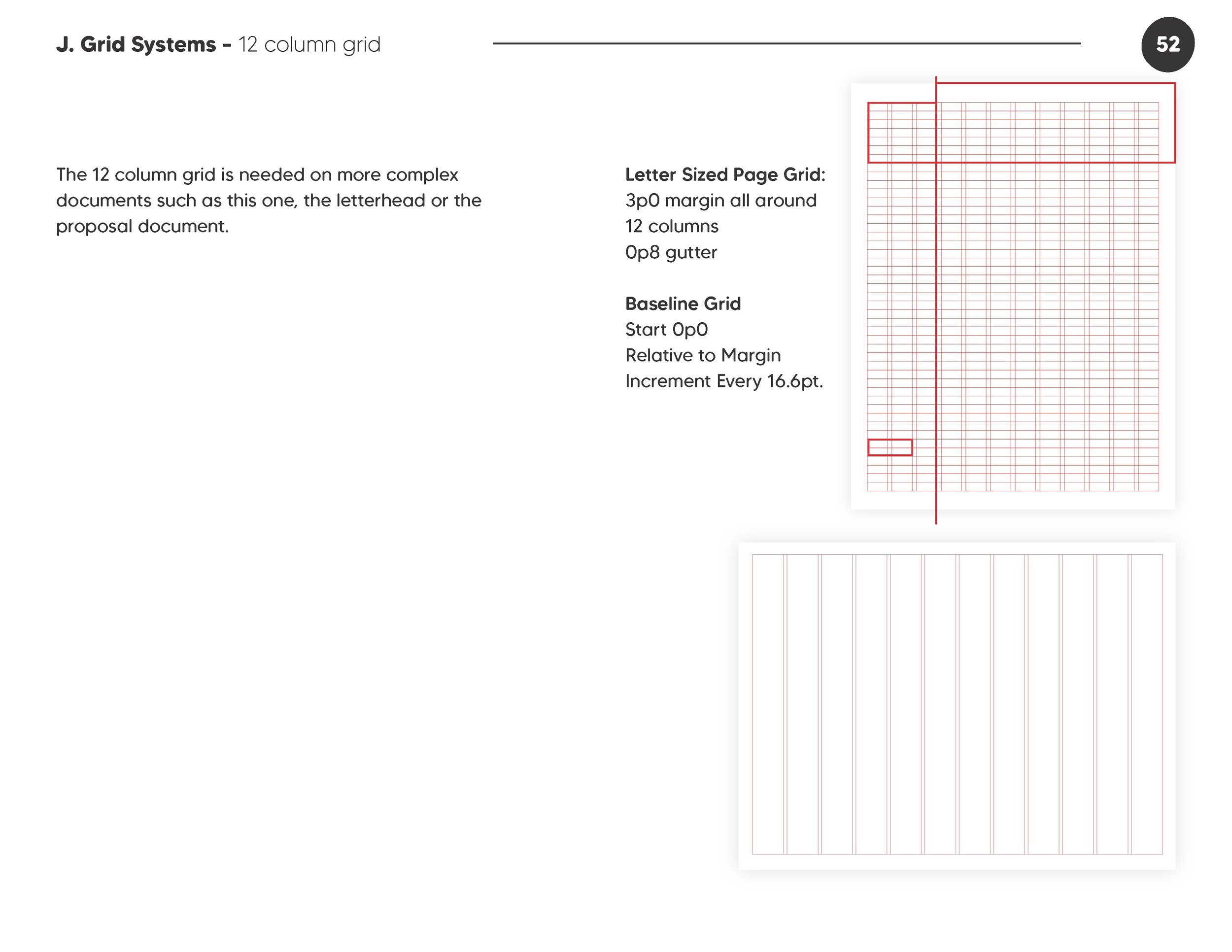
When creating the OSC brand identity guidelines book, I made sure to include the important details like logo construction and font guidelines.
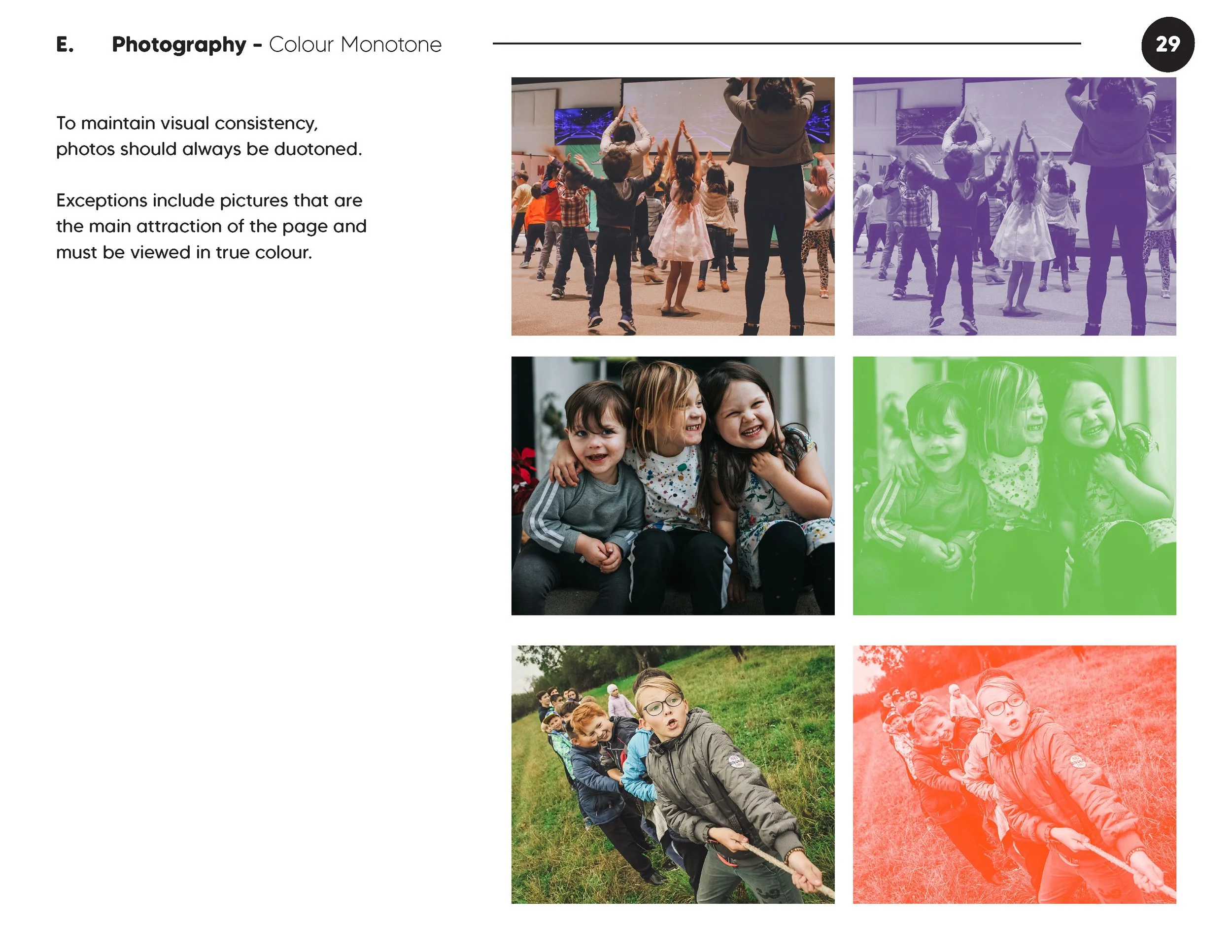
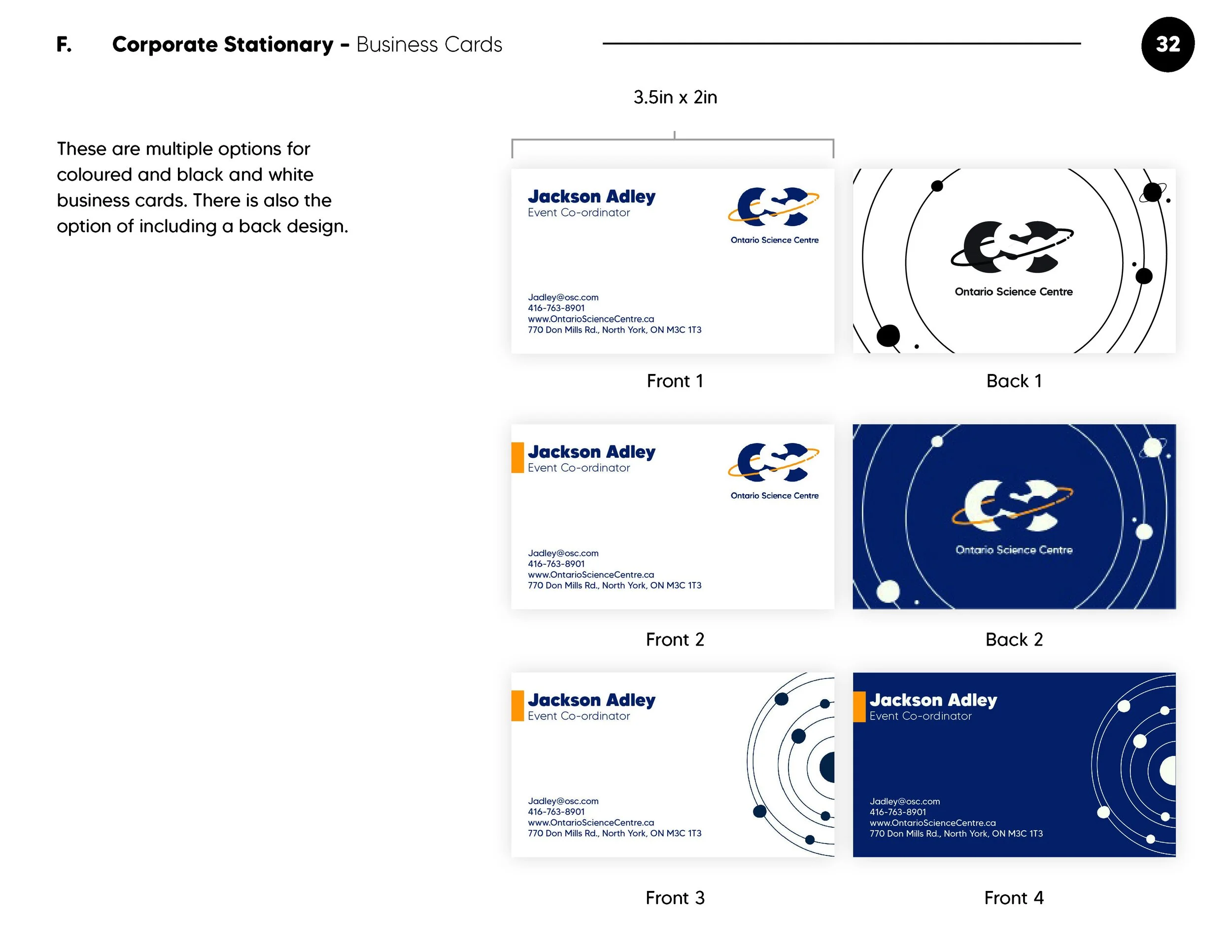
To assist other designers/developers even more I created guidelines for websites, marketing collateral, photography, envelopes and more.
There were a few things I learned when creating the guidelines book:
Style guides are extremely important, and creating good styles in InDesign makes life a lot easier!
Brands need to be flexible, including the logo and all the elements that make up the brand!
Save often!








Reflection
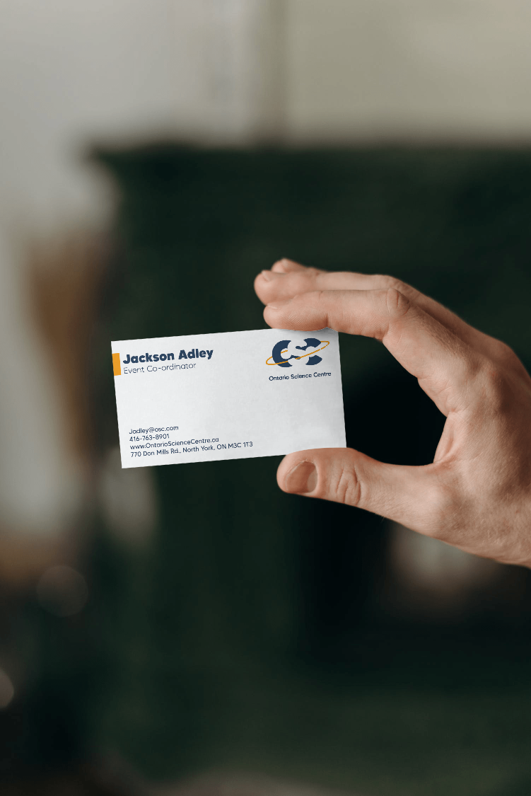
I had a lot of fun making this project as the Science Centre was one of my favorite places to go as a kid. I learned a lot about how a corporate identity might be used and made, and what needs to be considered when creating all types of brand materials.
Next Steps?
If I were to continue on with this project I would like to continue working on the logo to make it more legible. I would also put more effort into making the photography section more comprehensive, and I would add more specifications for the designs in documents like business and name cards.